Checkout & Order Experience
The checkout and order tracking pages are critical touchpoints in the core transaction flow of a large-scale food delivery platform. Over years of iteration, the pages accumulated complex information hierarchies, inconsistent interaction patterns, and rising customer complaints. This project aimed to fundamentally reimagine both pages — simplifying structure, strengthening fulfillment transparency, and elevating the end-to-end transaction experience.

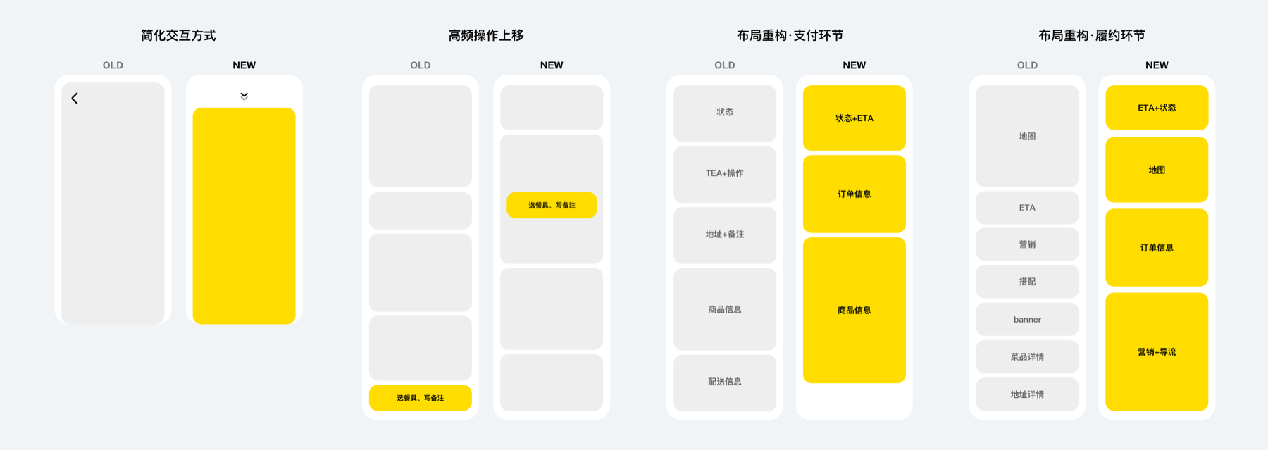
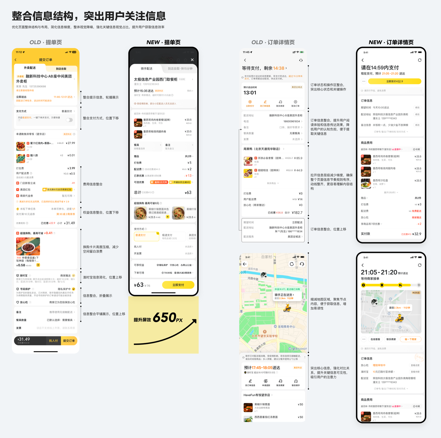
Restructure page architecture
Transformed the checkout from a full-page takeover into a lightweight half-sheet overlay, reducing perceived operational cost. Reordered information blocks based on user priority research and card-sorting analysis, consolidating scattered elements into a streamlined flow that balances user needs with business requirements from multiple stakeholder teams.
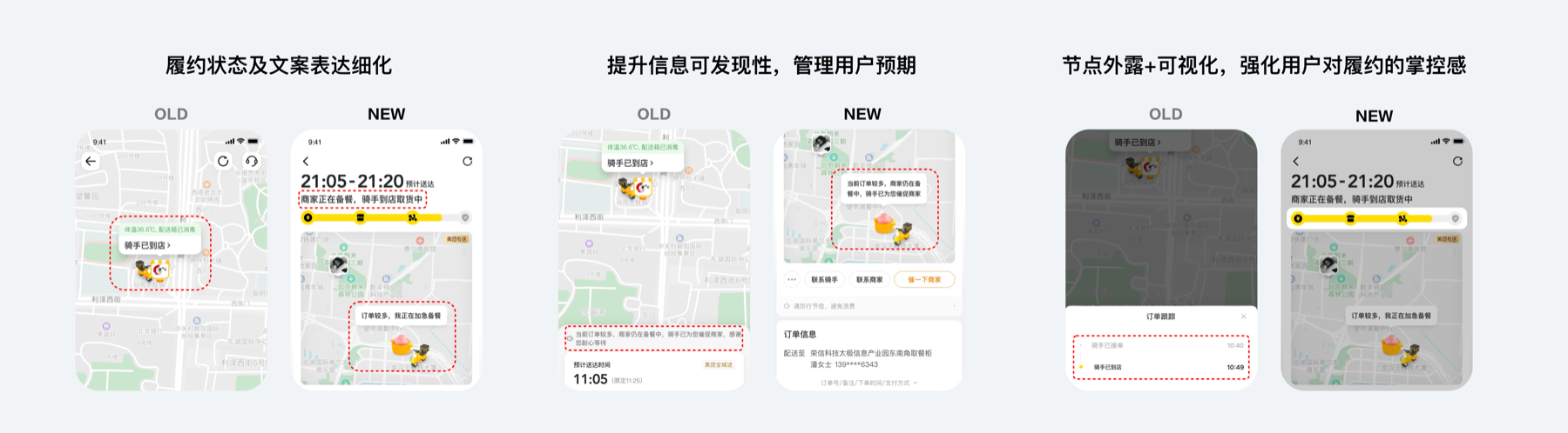
Enhance fulfillment transparency
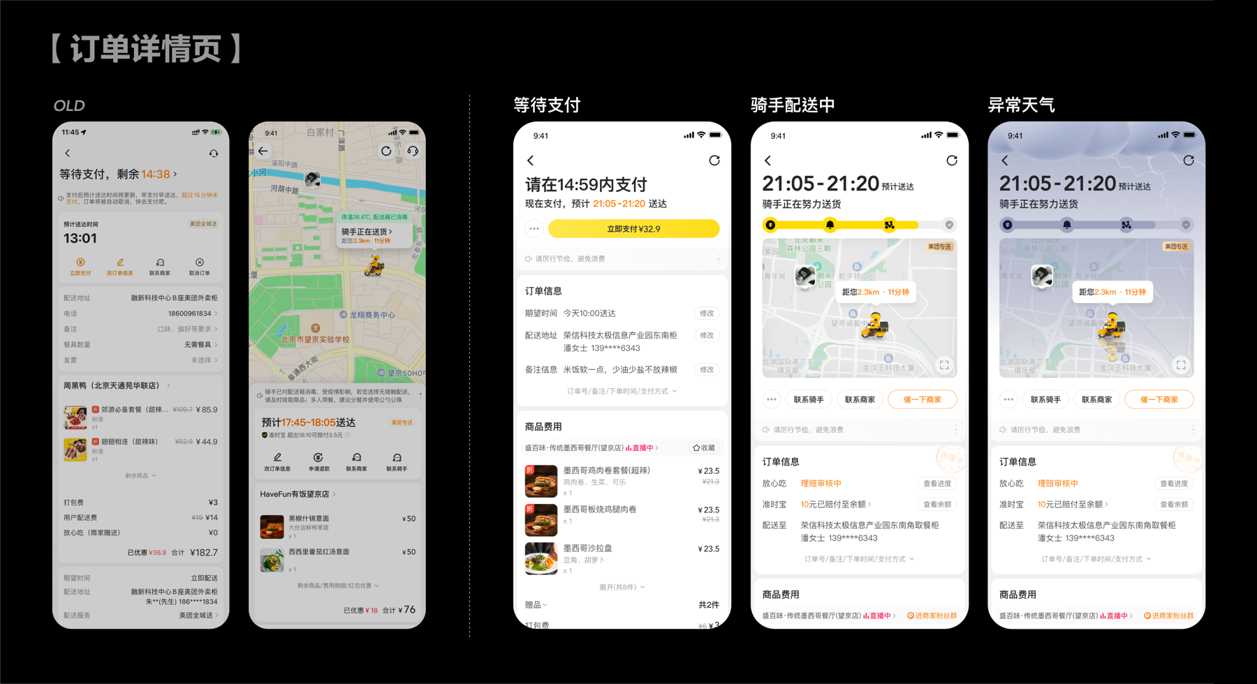
Conducted a full-state audit of the order tracking page, redefining display priorities for delivery status. Added progress nodes to give users a sense of control over the delivery process. Refined status copy and escalation visibility to proactively manage user expectations and resolve pain points that previously generated complaints.
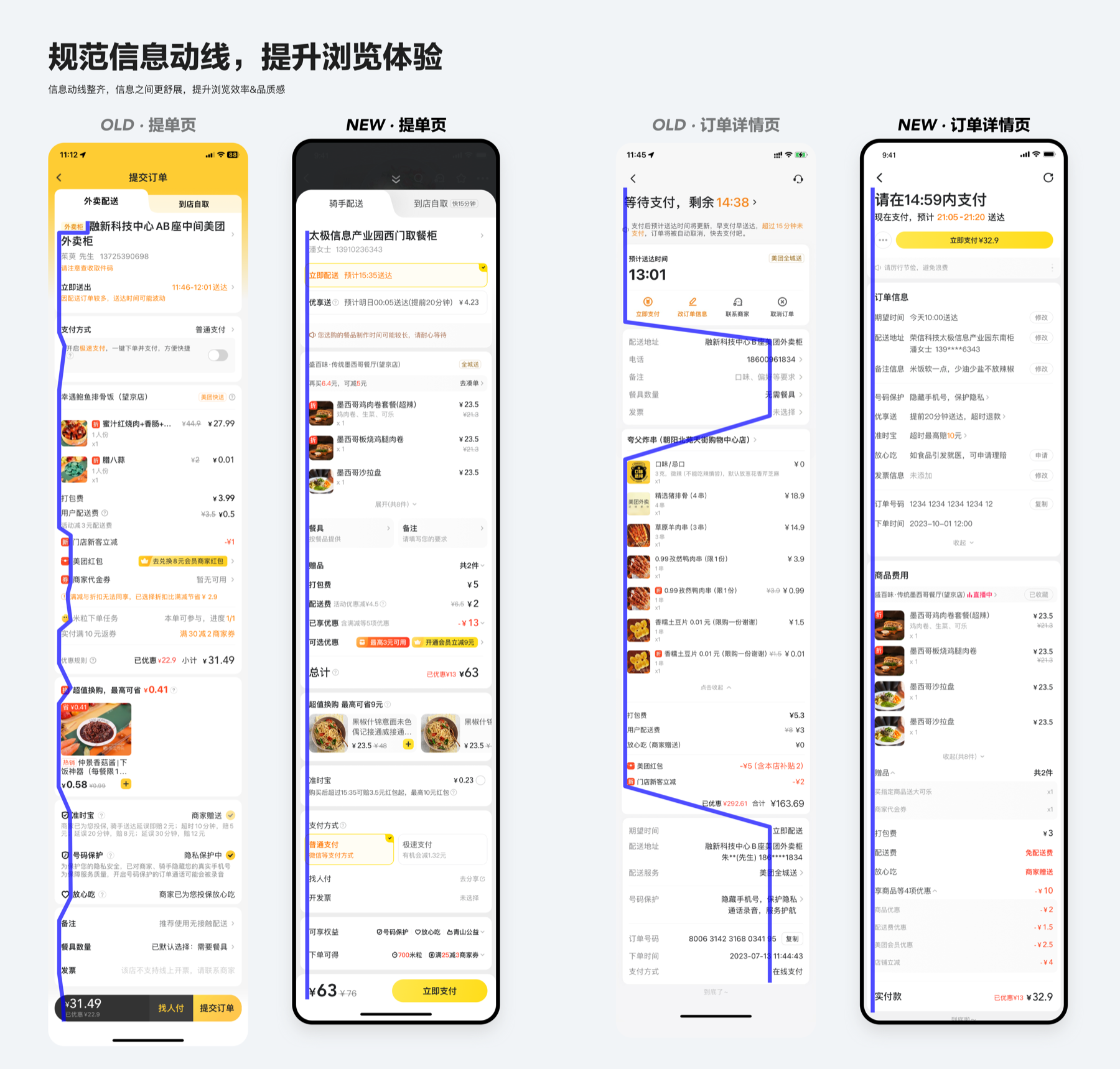
Streamline information flow
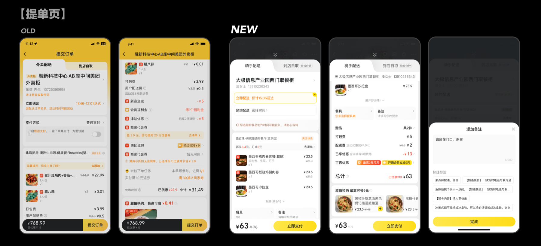
Unified inconsistent element styles, eliminated redundant visual layers, and standardized the reading flow across both pages. Redefined display rules to group related fields, simplify controls, and ensure edge cases render correctly — improving overall information acquisition efficiency.
Design output
Results
Customer complaint rate decreased by -n%; checkout conversion increased by +npp; and order completion improved by +npp.
Reflection
By restructuring the page architecture, refining fulfillment communication, and streamlining information design, the project delivered measurable improvements in conversion, completion, and user satisfaction while maintaining alignment with 10+ business teams' requirements.